Every frontend developer and every designer knows them: modals, dialogs, pop-ups, overlays – they have many names and describe a common UI element to achieve user actions, that need some kind of confirmation or should be taken out of the flow.
We relied on JS Frameworks to establish this for the longest time and it still was always more complicated then it should be, considering that it’s a pretty basic user interaction and doesn’t necessarily interact with anything on the site directly.
Advantage of using it the native way:
- If the modal version is used, the background of the dialog is blocked due to the backdrop
- If the modal version is used, we have support to close it via the “ESC”-Key
- more semantic HTML
Browser Support
All the way back in 2014 the <dialog> element was introduced with HTML 5.1 and it sadly still has very little browser support, considering how long it was in the spec and didn’t get taken off in the HTML 5.2 spec.
Today it’s supported by Chrome, Opera, Firefox post version 53, if you enable it in about:config and the UC Browser as you can see here:
https://caniuse.com/#search=dialog
So, shouldn’t we use it at all and stick with other JS solutions?
Not at all. We are lucky to have polyfill, which gives us a way to use features that are not yet supported by all browsers for quite some years yet.
In August 2015 polyfill for <dialog> was rolled out and made it possible to use this feature without worrying too much about browsers who don’t support it natively.
To use it you first off need to install it via
$ npm install dialog-polyfill
$ bower install dialog-polyfill
You can find everything necessary to set it up and download it as a zip here:
https://github.com/GoogleChrome/dialog-polyfill
JavaScript & CSS
To actually open the dialog and close it again, <dialog> got it’s own DOM-Interface.
There are actually two options to open it:
dialog.show() and dialog.showModal()
dialog.show() opens the dialog without any special attributes and dialog.showModal() opens the dialog as well and pushes the dialog to be in the foreground as well as blocking interaction with the background via a, by default transparent, backdrop.
To close it again we use dialog.close( [result] ) with the optional parameter [result] to be fed back and can be recalled via dialog.returnValue
The dialog.returnValue really comes into play as soon as you use a form in the dialog.
With <form method="dialog"> you can directly feed the value into returnValue and close the dialog with hitting the submit button.
Since there are quite some users that block out JS these days, there is a possibility to control the dialog via CSS as well.
To get this done we need to utilize the :target Pseudoclass
dialog:target {
    display: block;
}
To actually use :target we need the dialog to be targeted via the URI fragment, so everything behind the #, which is equivalent to the ID of the <dialog>, is mandatory for using it with CSS only.
<a href="#dialog">Delete</a>
<a href="#">Close</a>
<dialog id="dialog">
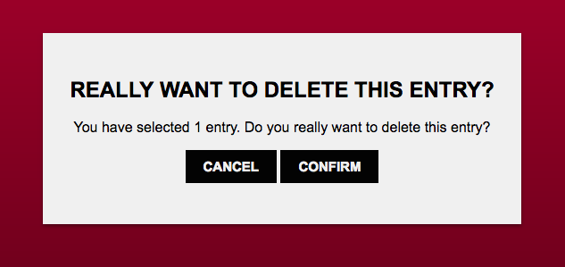
Do you want to delete this entry?
</dialog>
As soon as you click the link for “Delete” the dialog appears.
But take care, because using it this way will cause a jump to the top of the page as soon as you close the dialog.
The ::backdrop by default is transparent and can be styled like this:
dialog::backdrop {
    background: rgba(255, 0, 255, 0.25);
}
Codepen
All the explanation would be useless without an actual example
so I set up a codepen for you so you can check it our really quick: